Generating data in Python with Pandas
I’ve found myself with another free morning to practice Python. One of the things I’ve always heard about learning any new skill is that you should leave as long as possible after you learn anything before you practice it again. Helps it to settle. With that in mind, I’m going to keep on practicing with Pandas. This time I’ll be looking into how to 1) generate random numbers and 2) put them into a dataframe. That way next time I can start with a new dataframe to play around with.
import pandas as pd
import numpy as np
The first step is deciding on the variables I want. I’m imagining a survey of voters. I think I’ll go for a uniform distibution of region (meaning every region has equal probability). A random normal distribution of age. A bernoulli trial for political party. Finally another normal distribution of income. If I can do all of this without too much trouble then I’ll try to make it so the different political parties have different mean income levels. Although that sounds difficult.
I’ll start with regions because that should be the easiest.
np.random.seed(12345)
regions = ["North", "South", "East", "West"]
region = np.random.choice(regions, replace = True, size = 10000)
print(region[range(1,10)])
['South' 'South' 'South' 'North' 'South' 'East' 'East' 'South' 'East']
This looks good to me. 10,000 different regions. I’ll check how often each one appeared. You can do a histogram with a pandas series. I don’t know if you can then add a pandas series to a dataframe. I assume so.
region = pd.Series(region)
region.value_counts().plot(kind = "bar", color='#36b33a')
<AxesSubplot:>
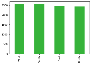
This looks pretty good. They all have around the same number of observations. Now to add it to the dataframe.
df = pd.DataFrame(data = region, columns= ["region"])
df
| region | |
|---|---|
| 0 | East |
| 1 | South |
| 2 | South |
| 3 | South |
| 4 | North |
| ... | ... |
| 9995 | West |
| 9996 | East |
| 9997 | North |
| 9998 | West |
| 9999 | East |
10000 rows × 1 columns
Not bad. Next I’ll make the first of the normal distributions: age.
age = np.random.normal(loc = 45, scale = 15, size = 10000)
age = pd.Series(age)
age.plot.hist(color='#36b33a', bins = 20)
<AxesSubplot:ylabel='Frequency'>
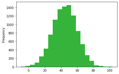
Not great. It’s definitely normally distributed, but I want it to start at 18, and I really don’t want anyone to have a negative age. I think it might be worth using a for loop to replace all the values below 18 with another random number.
for i in range(0, len(age)):
    while (age[i] < 18):
        age[i] = np.random.normal(loc = 45, scale = 15, size = 1)
And check to see if that worked.
min(age)
18.006346512121425
The minimum is good.
age.plot.hist(color="#36b33a", bins = 20)
<AxesSubplot:ylabel='Frequency'>
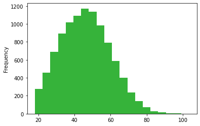
The histogram is also decent. Looks like what you would expect.
len(age)
10000
And the length is the same. It could be worth defining a function that does this, because I’ll have to do the same with income in a minute. I’ll come back to that. Next, though. Age is a bit too specific, I’ll want to round the numbers.
age
0       61.195320
1       69.635091
2       43.444925
3       31.755761
4       42.039641
          ...
9995    38.561477
9996    63.562329
9997    35.922581
9998    34.018789
9999    45.871190
Length: 10000, dtype: float64
age = round(age)
age
0       61.0
1       70.0
2       43.0
3       32.0
4       42.0
        ...
9995    39.0
9996    64.0
9997    36.0
9998    34.0
9999    46.0
Length: 10000, dtype: float64
I’m happy with this now. I’ll add it to the existing dataframe.
df["age"] = age
df
| region | age | |
|---|---|---|
| 0 | East | 61.0 |
| 1 | South | 70.0 |
| 2 | South | 43.0 |
| 3 | South | 32.0 |
| 4 | North | 42.0 |
| ... | ... | ... |
| 9995 | West | 39.0 |
| 9996 | East | 64.0 |
| 9997 | North | 36.0 |
| 9998 | West | 34.0 |
| 9999 | East | 46.0 |
10000 rows × 2 columns
Bernoulli trials next. I’m imagining a circumstance where there’s only two political parties so I can use binary values to represent them. In this case a 1 will mean a vote for the party of the tenants, and a 0 will mean a vote for the party of the landlords.
party = np.random.binomial(n = 1,size = 10000, p = 0.6)
party
array([0, 1, 1, ..., 1, 1, 1])
party = pd.Series(party)
party.value_counts().plot(kind = "bar", color="#36b33a")
<AxesSubplot:>
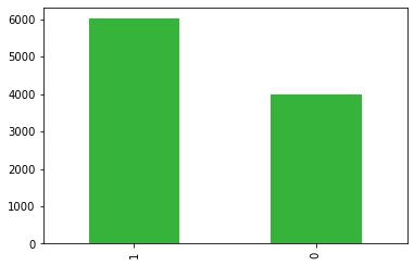
This looks like what I wanted. I specified that any 1 voter had a 0.6 probabilty of voting for the tenants, and it looks like around 6000 out of the 10,000 did. Exactly what we would expect. Let’s add it to the dataframe.
df["party"] = party
df
| region | age | party | |
|---|---|---|---|
| 0 | East | 61.0 | 0 |
| 1 | South | 70.0 | 1 |
| 2 | South | 43.0 | 1 |
| 3 | South | 32.0 | 0 |
| 4 | North | 42.0 | 1 |
| ... | ... | ... | ... |
| 9995 | West | 39.0 | 0 |
| 9996 | East | 64.0 | 1 |
| 9997 | North | 36.0 | 1 |
| 9998 | West | 34.0 | 1 |
| 9999 | East | 46.0 | 1 |
10000 rows × 3 columns
Now for the difficult bit. I want to generate income as two different normal distributions. One with a higher mean for the landlord voters. How do I do this? I’ll start by adding the empty vector to the dataframe.
df["income"] = -99
df
| region | age | party | income | |
|---|---|---|---|---|
| 0 | East | 61.0 | 0 | -99 |
| 1 | South | 70.0 | 1 | -99 |
| 2 | South | 43.0 | 1 | -99 |
| 3 | South | 32.0 | 0 | -99 |
| 4 | North | 42.0 | 1 | -99 |
| ... | ... | ... | ... | ... |
| 9995 | West | 39.0 | 0 | -99 |
| 9996 | East | 64.0 | 1 | -99 |
| 9997 | North | 36.0 | 1 | -99 |
| 9998 | West | 34.0 | 1 | -99 |
| 9999 | East | 46.0 | 1 | -99 |
10000 rows × 4 columns
Then I have to try to generate these two different normal distributions, also keeping in mind that nobody can have a negative income (unlike in real life). A major disclaimer on this bit of code: I do not know how best to do this. For convenience I made the placeholder series into -99 so I could have a while loop which repeated the generation of random values when income < 0. This is probably unnecessary and is definitely a strain on the computer. I’ll try to find a faster way to do this.
for i in range(0, len(df["party"])):
    while df["income"][i] < 0:
        if df["party"][i] == 0:
            df.loc[[i],"income"] = np.random.normal(loc = 40000, scale = 4000, size = 1)
        elif df["party"][i] == 1:
            df.loc[[i],"income"] = np.random.normal(loc = 28000, scale = 6000, size = 1)

df
| region | age | party | income | |
|---|---|---|---|---|
| 0 | East | 61.0 | 0 | 41240.175985 |
| 1 | South | 70.0 | 1 | 30820.712654 |
| 2 | South | 43.0 | 1 | 35118.509739 |
| 3 | South | 32.0 | 0 | 40804.859910 |
| 4 | North | 42.0 | 1 | 32241.494249 |
| ... | ... | ... | ... | ... |
| 9995 | West | 39.0 | 0 | 42027.557719 |
| 9996 | East | 64.0 | 1 | 25218.748753 |
| 9997 | North | 36.0 | 1 | 31797.389325 |
| 9998 | West | 34.0 | 1 | 27783.427853 |
| 9999 | East | 46.0 | 1 | 27967.796060 |
10000 rows × 4 columns
And rounding these
df.loc[:,"income"] = round(df.loc[:,"income"], 2)
df
| region | age | party | income | |
|---|---|---|---|---|
| 0 | East | 61.0 | 0 | 41240.18 |
| 1 | South | 70.0 | 1 | 30820.71 |
| 2 | South | 43.0 | 1 | 35118.51 |
| 3 | South | 32.0 | 0 | 40804.86 |
| 4 | North | 42.0 | 1 | 32241.49 |
| ... | ... | ... | ... | ... |
| 9995 | West | 39.0 | 0 | 42027.56 |
| 9996 | East | 64.0 | 1 | 25218.75 |
| 9997 | North | 36.0 | 1 | 31797.39 |
| 9998 | West | 34.0 | 1 | 27783.43 |
| 9999 | East | 46.0 | 1 | 27967.80 |
10000 rows × 4 columns
This all looks good to me. I can look at the mean values of income for each party now, just to check. I can do this using a pivot table which works roughly the same as tapply() in R.
df.pivot_table(columns = "party", values = "income", aggfunc=("mean"))
| party | 0 | 1 |
|---|---|---|
| income | 39965.636696 | 27913.368541 |
This looks almost exactly right. Now to check out the histograms. Unfortunately, just like with ggplot2 this will involve reshaping the dataframe.
df_wide = df.pivot(columns = "party", values = "income")
df_wide
| party | 0 | 1 |
|---|---|---|
| 0 | 41240.18 | NaN |
| 1 | NaN | 30820.71 |
| 2 | NaN | 35118.51 |
| 3 | 40804.86 | NaN |
| 4 | NaN | 32241.49 |
| ... | ... | ... |
| 9995 | 42027.56 | NaN |
| 9996 | NaN | 25218.75 |
| 9997 | NaN | 31797.39 |
| 9998 | NaN | 27783.43 |
| 9999 | NaN | 27967.80 |
10000 rows × 2 columns
This now has the different incomes for the different parties on each column.
df_wide.plot.hist(bins=100, alpha=0.7, color=["#36b33a", "blue"])
<AxesSubplot:ylabel='Frequency'>
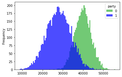
That looks pretty reasonable to me. And a good place to stop.
Dr Greg Stride
Researcher
My research interests include public policy, UK elections, and election administration.