Making a Map of Exeter using geojson and ggplot2
A few weeks ago I discovered the Exeter Data Mill, an amazing project where really interesting data about Exeter are collected and published. This included a very interesting series of files called “Exeter shapes and locations” available under the Open Government License.
I’m not usually one for maps, but this struck me as a good opportunity to learn a new skill. I decided to try to make a map of Exeter postcode districts. Then, because a map on its own is not very helpful, I wanted to make up some data I could use to make a rudimentary heatmap on top of the postcode areas.
The first step was loading all of the packages I would need for this. After much trial and error I decided that I needed geojsonio, ggplot2, and broom.
library(ggplot2)
library(geojsonio)
library(broom)
I found nearly all the info I needed to make this map by using the R graph gallery.
I then needed to download the geojson data and save it as an R object.
spdf <- geojson_read("map/EX_Sectors.geojson", what = "sp")I then needed to tidy the data to get it into a usable format using the tidy() function of the broom package.
spdf_fortified <- tidy(spdf, region = "name")The next step is making a lookup to identify different regions. I got this idea from the ggplot2 website.
I want to make sure I have every postcode region as a single item, so I wanted to delete the duplicates.
spdf_fortified$postcode <- gsub(" .*", "", spdf_fortified$group)set.seed(1234)
values <- data.frame(postcode = unique(spdf_fortified$postcode),
value = runif(length(unique(spdf_fortified$postcode)),0,0.99))
head(values)## postcode value
## 1 EX1 0.1125664
## 2 EX10 0.6160764
## 3 EX11 0.6031820
## 4 EX12 0.6171456
## 5 EX13 0.8523062
## 6 EX14 0.6339075The values dataframe is a dataframe with 2 columns. The postcode area and the value, which is our imagined data. Perhaps it is the proportion of the population with a degree or something to that effect.
Next we need to merge the two dataframes, matching based on postcode.
merged_df <- merge(values,spdf_fortified, by = c("postcode"))And finally plot the results. geom_polygon does nearly all of the work for us, we only need to add the alpha value to make sure the different values appear at different levels of opacity.
ggplot() +
  geom_polygon(data = merged_df, aes( x = long, y = lat, group = group, alpha = value), fill="#489D5D", color="white") +
  theme_void() +
  coord_map()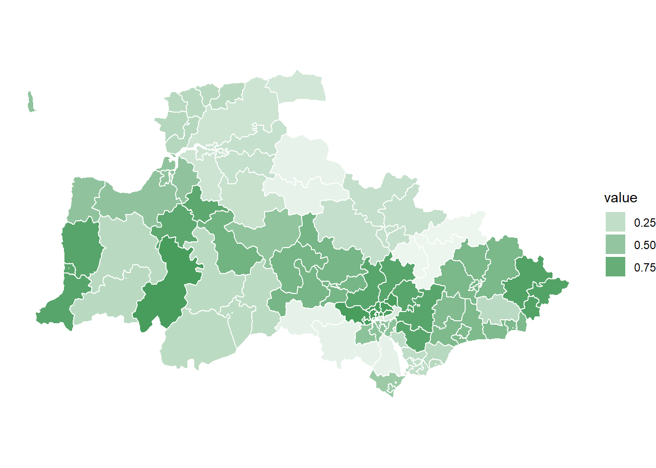
Dr Greg Stride
Researcher
My research interests include public policy, UK elections, and election administration.